Task 1 / Exercises
Typography / Task 1: Exercise
4/7/23 - 5/13/23 / Week 1 - Week 5
Low J- Yin / 0352888.
Bachelor of Design in Creative Media / Typography
LECTURES
Week 1(a): Briefing
For this week, the lecturer introduced himself and started briefing us
for:
- The step of how we do e-portfolio.
- Google Docs to key in our blogger links and feedback.
- The form text only could use the template that was given.
- Word Expression ( Project 1 ): Surprise, Silence, Party, Split, Destroy,
Surprise
- General Feedback needs to write into google docs.
- Clean, Tidy, and simple are the most important for typography.
Week 1(b): Development / Timeline
Written from the perspective of the Western world.
Early letterform development: Phoenician to Roman

fig 1.1 Letterform development
-The form of upper letters from have developed from straight lines and pieces
of circles.
-Material using soft clay, stone, etc.
Phoenicians

fig 1.2 Direction of Greek changes
-Greek changed the direction of writing, and developed a style of
writing called "boustrophedon".
-The direction of the letterform from right to left and turn back the
direction and go right to left.
-Estrucan carvers working in marble change the weight from vertical to
horizontal, which carried over into carved letterforms.

fig 1.3 The development of "A" letterform

fig 1.4 Rustic capitals
-The development of lowercase letterforms is from written forms simplified for
speed.
Square Capitals
-The letterforms will have serifs added to the finish of the main
strokes.
Rustic Capitals
-A compressed version of square capitals.
-Allowed for twice as many words on a sheet of parchment.
-Hard to read due to their compressed nature.

fig 1.5 Uncials fonts
Uncials
-Refers to a letter that is one inch in height.
-Don't have upper/lower forms.
Half Uncials
-Mark the format beginning of lowercase letterforms
Charlemagne
-The first unifier of Europe since the Romans,
-Entrusted task to Alcuin of York.
-Rewrote the texts using both majuscules (uppercase), minuscule,
capitalization, and punctuation.
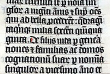
fig 1.6 Black letter
-A rounder more open hand gained popularity, called the "rotunda"
-The humanistic script in Italy is based on Alcuin's minuscule.
Timeline of letterforms
1450 Blackletter - The earliest printing type.
1450 Blackletter - The earliest printing type.
1475 Oldstyle - Based upon the lowercase forms used by Italian humanist
scholars for book copying.
1500 Italic - Echoing contemporary Italian handwriting.
1550 Script - Attempt to replicate engraved calligraphic forms.
1750 Transitional - A refinement of old-style forms.
1775 Modern - Represent a further rationalization of old-style
letterforms
1825 Square Serif - Heavily bracketed serif, with little variation
between thick and thin strokes.
1900 Sans Serif - Typefaces eliminated serifs altogether.
Week 2: Basic
Desricbing letterforms
1. Baseline - Visual base of letterforms.
2. Median - The line to define the x-height of letterforms.
3. X-height - The height of lowercase "x".
4. Stroke - Line that defines the basic letterform
5. Apex
6. Vertex - Point created to join the two diagonal stems.
7. Barb - Half serif finish on curved stroke.
8. Beak - Half serif finish on horizontal arms.
9. Bowl - Rounded form
10. Bracket - Transition between the serif and stem.
11. Cross Bar
12. Cross Stroke - Horizontal stroke in letterform that joins two
stems.
13. Serif - Right-angled or oblique foot at the end of the stroke.
14. Stem - The significant vertical.
The fonts
1. Uppercase
2. Lowercase
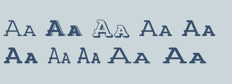
fig 2.1 Small capitals
3. Small Capitals- uppercase letterforms are drawn to the X-height in the typeface.
fig 2.2 Uppercase numerals
4. Uppercase Numerals - Same height as an uppercase letter.

fig 2.3 Lowercase numerals
5. Lowercase Numerals - Old style figure.
6. Italic & Roman

fig 2.4 Characters
7. Punctuation, miscellaneous characters
8. Ornaments - used as flourishes in invitations or certificates.
Week 3 (a): Text/ Tracking

fig 3.1 Kerning
-"Tracking" adjust spacing uniformly over a range of characters.
-For word heading use.
'Kerning'
Automatic adjustment of space between individual letterforms.
Letterspacing
Add space between the letters.
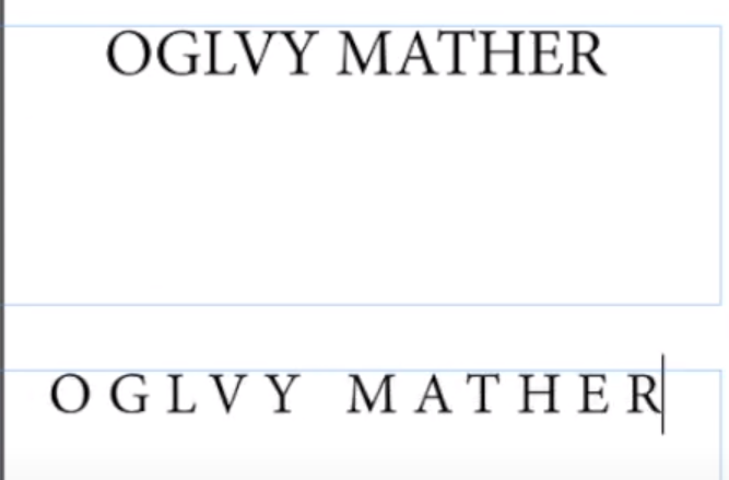
fig 3.2 Kerning differnece
-InDesign is used for text format, and Illustrator uses more for graphic
design.
-If designing book pages, would be better if opened the "facing pages".

fig 3.3 Tracking
-The white space between the word in a sentence is important to let the audience recognize it.
-The form and shape are the way how we memorize the word, therefore the space
between the words would also affect us.
-Avoid increasing/reducing letterspacing for lowercase forms.

fig 3.4 Loose tracking example
Week 3 (b): Text/ Formatting Text
Alignment: Flush left

fig 3.5 Flush left
-Ragged left.
Alignment: Centered
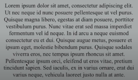
fig 3.6 Centered
-Create a strong shape in the image, the text does not appear to be jagged.
-Difficult to read if the paragraph is too long.
-Only could be used for a small amount of text.
-Ragged left and right.
Alignment: Flush Right

fig 3.7 Flush right
-Only could be used for a small amount of text.
-It can be useful for situations where the relationship between text and image
is ambiguous without a strong orientation to the right.
-Ragged right.
-Ragged right.
Alignment: Justified

fig 3.8 Justified
Week 3 (c): Text/ Leading and Line length
1. Type size
-Size should be large enough to read for the reader.
2. Leading

fig 3.9 Leading
-A type that is set too loosely creates stripped patterns that distract the reader.
3. Line length
- Good rule of thumb is to keep the line length between 55 - 65 characters.
- Extremely long or short line length impairs reading.
Week 4: Text/ Indicating Paragraphs
fig 4.1 Pilcrow
-Instead of creating paragraph space, some of the books would type 'pilcrow'
to move the space.

fig 4.2 Leading and line space
-'Leading' means each line of text.
-Paragraph leading should be between or the same as line space, to maintain
the cross alignment.
-Line space means the line between sentences and sentences.
-Line space means the line between sentences and sentences.
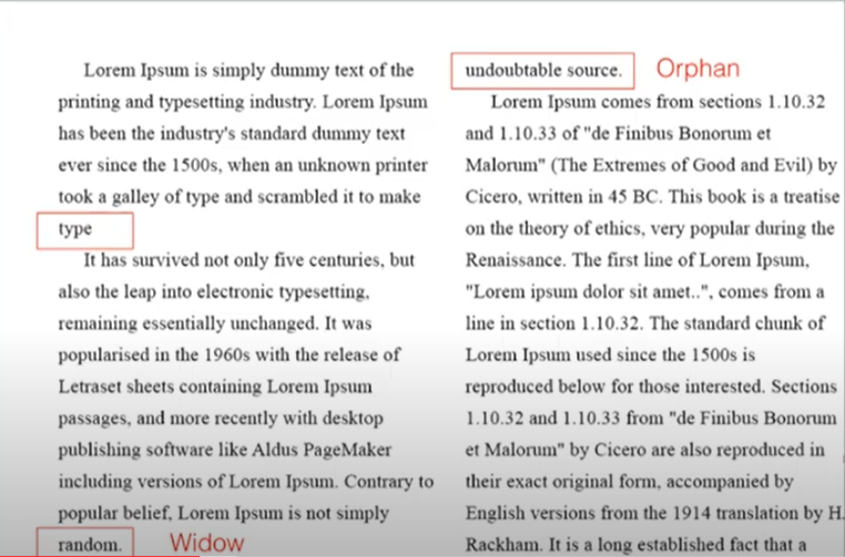
fig 4.3 Widow and orphan
Widow - Short line of the type left alone at the end of a column of text.
Orphan - Short line of the type left alone at the start of the new
column.
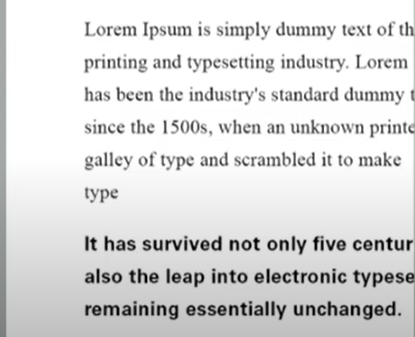
fig 4.4 Highlight text
- Highlighting the important part by increasing the weight of the text, changing the typefaces or the colors.

fig 4.5 Highlighting text
-When changing the typefaces, is good to change the point size by.5 to match
the x-height of the serif typefaces.

fig 4.5 Typefaces
Week 5: Letter/ Understanding letterforms
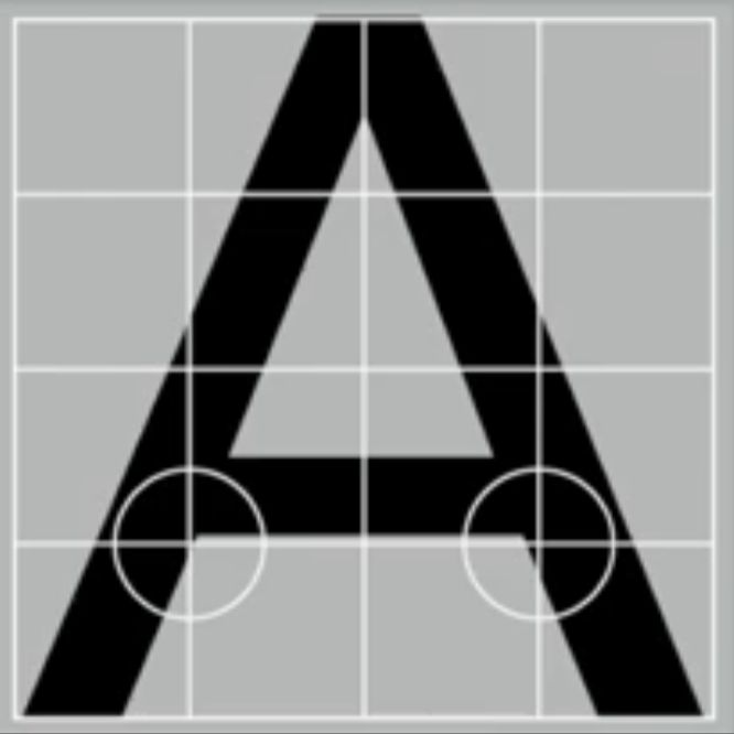
fig 5.1 Letterform
-The two different strokes weights showcase that the uppercase letters are
not symmetrical.
-The strokes between the left slope are thinner than the right strokes.
This particular uppercase letter shows that it's a fact that letters are
not equal in weight.
Letter/ Maintainy x-height

fig 5.2 X-height
-The curve strokes, such as "r" or "s", must rise above the baseline.
-To appear to be the same size as the vertical and horizontal strokes they
adjoin.
-X-height is the line between the baseline and the mean line of lowercase
letters.

fig 5.3 Counter form
-Blankspace as the counter form.
How to turn on the letter/ symbol form inside the x-height?

fig 5.4 Screenshot of Zoom meeting
By pressing the button, the word will remain in the uppercase letterform but inside the x-height.
Week 6: Screen & Print
Print type vs Screen Type

fig 6.1 Print type fonts
"Print type"
- The font or typefaces used when printing text on paper on other
media.
- Ensure that the text is smooth, flowing, and pleasant to read.
- Characteristics need to be elegant and intellectual but also highly
readable when set at a small font size
Exp: Print-Caslon, Garamond, Baskerville
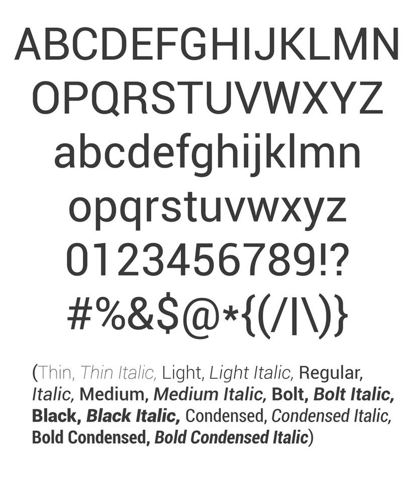
fig 6.2 Roboto fonts
"Screen Type"
- The font or typeface used when displaying text on a computer or other
electronic device's screen.
- Typefaces intended for use on the Web are optimized and often modified to
enhance readability and performance onscreen.
Exp: Verdana, Calibri, and Roboto.
Hyperactive Link/ Hyperlink
-A clickable element on a web page or in an electronic document that, when
clicked, takes the user to a new document or new section
System Font For Screen
-The font is installed on the computer or device and available for use in
displaying text on the screen.
Exp: Times New Roman, Arial, and Helvetica
Web Safe Fonts
-A subset of system fonts that are widely available across different
operating systems and web browsers, ensuring that they will display
consistently for all users.
Static
-Static typography refers to a type that is designed to be viewed as a
static, stationary element.
Motion
-Motion typography, on the other hand, refers to a type that is designed
to be viewed in motion or animation.
INTRODUCTION
<iframe
src="https://drive.google.com/file/d/12pGq93BDBYd4zwm_YLu1GQdtscJ3zDS3/preview"
width="640" height="480" allow="autoplay"></iframe>
TASK 1 / EXERCISE 1 - TYPE EXPRESSION
SKETCHES
fig 7.1 Sketches, (11/4/23)
For the part of sketching of pause, using the Signiant icon to match the word
to express the meaning I want to represent to the audience. The result does
not turn out well as I think, So I try other words to experiment with how to
make it look better.
Next, I try to split the "split" word to match the meaning of the
word. Using different word fonts to make the "split" looks separate as
different parts of both.
I also researched some designer design typography on Pinterest. All the
design looks clean and clear. The form might be arranged in a different place
but you could clarify what word the designer is trying to show.
DIGITISATION

fig 7.2 Type expression process, (20/4/23)

fig 7.3 Type expression "silence", (20/4/23)
For the design of the first (top left), I tried to use a different shade of
white to make the silence more invisible to make it looks expressing how
silent it is in the area of the square. Next, I try using a different shade
of black as the background and arranged the typeface a small size at the
bottom of the square to make the space looks empty and silent.

fig 7.4 Type expression "split" "surprise" "party", (20/4/23)
I like the middle bottom design for the part of the words "split". I
inverted the "L" and made the size of the letter full filled up the space
and separated other words, to make the letters look like had been split in
half.
The design of the first line of the right, which is the "split" word, using
the variety and contrast of the black and white color, looks like the word
had been split into different spaces of the square.
The design of the "surprise", uses a different color of "surprise", and
arranges words from the bottom left to top right to make it easier to read
for the audience.

fig 7.5 Type expression " dance" "surprise" "pauses", (20/4/23)
I try to use different shades of black to make the "dance" words look like actually dancing, and driving different directions to make it like the sentence are moving.
In the bottom right of the "pause" design, arrange the significant icon in
the middle of the space to make it more attractive and vivid, making the
message I trying to send more obvious. The "PA" and "SE" put the side of the
image, and empty the space in the middle to make it really pause the image.
 +++
+++
fig 7.6 Final Type Expression, (22/4/23)
fig 7.7 Final Type Expression, (4/22/23)
Type Expression Animation

fig 7.8 Animation "split", (4/26/23)
First, I try to animate the "split " type expression. Using the "S" as the
main point and the "plit" split the "S" into half. I didn't save the
final result as the result needs to look better. Mr. Vinod also gives me his
feedback to don't use the design and using another design. I decided to
delete this design and start a new design.

fig 7.9 Animation "split" process, (4/28/23)
For this animation "split", I did 22 frames. I wanted the result looks like
the "L" cut off the "sp" and "it" to stick together, but the result instead
of really "split out" the words, looks like "run away" from the "L". So, I
cut off the last few frames where the "sp" and "it" run away and added the
second of the last frame to 0.5 seconds, to make the words quickly split out
when the "L" reached the space.

fig 7.9 Animation "split" process, (4/28/23)
With the result, I try on another type of expression to see which one has a better final result.

fig 8.0 Animation process " pauses", (4/28/23)
I accidentally do too much of frames, for a total of 29. The final
result shows that the speed is too slow and might make the audience
unable to watch until the end. So, I need to delete some of the frames
to make it smoother.

fig 8.1 Animation process "pauses", (4/28/23)

TASK 1/ EXERCISE 2 - TYPE FORMATTING
Kerning & Tracking

fig 8.3 Text formatting, (5/3/23)
Layout
Follow by the instruction and the brief, I tried to adjust the different
outputs for different arrangements and layouts.

fig 8.4 Text formatting progress, (5/4/23)
Adjustment
Eventually, I had to choose one of the layouts as they start to test out the result.

fig 8.5 Text formatting progress, ( 5/5/23)
First, I check on every line of my character is it between 55-65. The result
shows there are some lines above 68. So I had to change the font size and
leading to make it more balanced.

fig 8.6 Text formatting progress, (5/5/23)
As for this step, I changed all of the capital in height in the last paragraph
meanwhile I am doing the kerning.
After turning on the subscript, the font size will look smaller and the font
will not reach the baseline, So I make a slight adjustment for this particular
part:
Baseline Shift: 5 pt
Font Size: 5 pt

fig 8.7 Subscript adjustment, (6/5/23)
After the adjustment, the word would not stand out and look more follow the
flow of the line.

fig 8.8 Hidden character, (6/5/23)
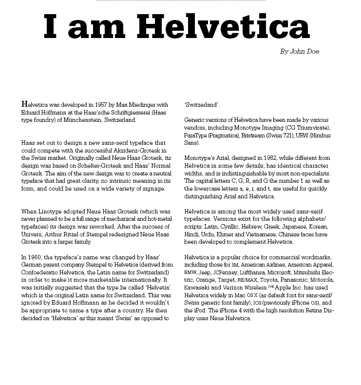
fig 8.9 Kerning, (7/5/23)
Last, I checked my letterspacing and kerning for every paragraph. The sense of my eyes, the paragraph seems more clear and more tidy after the adjustment. I checked every line of tracking to ensure it is between 0-20 and the kerning is 5/1000 em. To catch people's eyes when looking at the paragraph, I also decided to use the same type of font but with bold on the first word of "H" in the first paragraph, to make sure the reader read from there to the end.
In the end, I still not satisfying, so I changed the alignment to left
justified and the title font size, and typeface, to see the output.

fig 9.0 Text Formatting Layout, (10/10/23)
Final Text Formatting Layout
HEAD
Font/s: Bembo Std / Bold
Type Size/s: 55 pt
Leading: 57 pt
Letter Spacing: -15
BODY
Font/s: Serifa Std / 45 Light
Type Size/s: 10 pt
Leading: 12 pt
Paragraph spacing: 12 pt
Characters per line: 61
Alignment: left justified
Margins: 12.7 mm top+ left + right + bottom
Columns: 4
Gutter: 5 mm
fig 9.1 Final Text Formatting (PDF), (10/5/23)

fig 9.1 Final Text Formatting-Grid, (10/5/23)
fig 9.1 Final Text Formatting-Grid (PDF), (10/5/23)
FEEDBACK
Week 2:
General Feedback - Using the template
from google drive. Avoid using graphics and form to represent the words.
Keep clear and direct to show the meaning of words. Be careful when
doing the idea and the expression of the word will be the match of
meaning. The idea must be strong and convincing when representing the
meaning.
Week 3:
General Feedback - Sir had given 45
minutes to give us feedback, I don't dare to share on screen, so I
listen to how and what he had given to others type expression feedback.
The words need to be simplified, clean, and tidy. As long as the letter
had matched the meaning, even the design is simple would be fine too.
Week 4:
General Feedback -Try to use the
simplest way if your design skills are not that well, you could slowly
develop your own design after you understand how its works.
Specific Feedback - Don't separate the
S into a single big word, using another design would be better. Use the
pause design for animation.
Week 5
Specific Feedback - Cross alignment to ensure the word is not
crossed over. The" I am" is a short text and making the "Helvetica"
bold, would et the text too different and unbalanced. When the capital
in height would stand out from the text, the rhythm of the text would be
broken, we could use small capital would follow (sen serif font doesn't
have the capital). Do not use a force-line base. The image using match
the text. Be careful with the hyphen. While using left alignment, one
must be careful in the ragging, avoiding looks like justified alignment.
Week 6
Specific Feedback - Be careful with the raging. The code uses the
._ on behind the words or using ._ to represent the Morse code. Using
the real Morse code to do, don't simply place the dots and
underscore.
REFLECTION
Experience
It was a very challenging module for me. Every detail and information had to
be clear and clarification is the most difficult part for me. Before
learning this module, I never thought that a page of a paragraph takes so
much patience and potential to focus on the task and also to write down
notes of every detail. I would not say it was a very fun module, but a very
struggling module for me. But I enjoy how I am satisfied after struggling a
lot and having a better output.
Observation
As we learned through the module, sir had taught us by his way, to test out
the result on our own. Sir had taught us how to do it, and we will need to
learn how to get the final output by ourselves and having own judgment, to
observe what we had to do for the next step and to have a better judgment on
our own, which actually help us a lot to get better to know how this module
work.
Findings
Every word, letterspacing, and detail is the most important part for every
designer. Graphic Designers not just only need to learn how to do graphics
and design, but we will also need to know every spacing of the word, every
different effect of typefaces, and every line of the paragraph. It was a
struggling and hard module, but I enjoy to make friends with typography.
FURTHER READING

fig 10.1 Typographic design: Form and communication (2015)
I been started to read the book sir had recommend < Typographic design:
Form and Communication > . I had actually get impressed when first I saw
the alignment on first few page.

fig 10.2 Alignment of the book

fig 10.2 Evolution
I started to read few of the pages after the impression. We can still seen some of the typeface are still the population of the work, for sample the typeface of early gothic.

fig 10.3 Construction of the letter B
From the book, we could know that how is the construction of the letter B,
from Albrecht Durer and Geoffrey Tory.

The revolution of the typeface had been design different style and ways by
developing. Many artist using their own design idea and change the font size
and the typeface. The typeface had been designed to the first fat face, the
first Egyptian, the first serif face and more on.
fig 10.4 Typeface

fig 10.5 The evolution of typeface in 80's
While I was reading the book, I find out some interesting knowledge: The
typeface of Coca Cola was invented on 1980s. Coca-Cola utilises a
custom font for its trademark and the style of the lettering used is called
" Spencerian Script", it is a type of cursive handwriting.
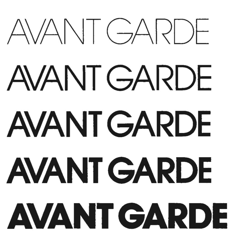
fig 10.6 the changes of same typeface
Using same typeface but different element could also make the typeface looks very different as in:
1. Weight Changes
2. Proportion
3. Angles
4. Elaboration

fig 10.7 Letter
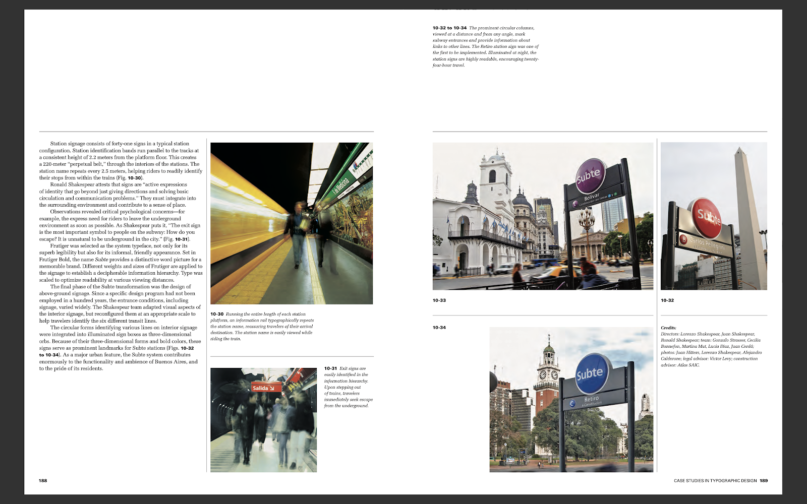
fig 10.8 Sign

fig 10.9 Typographic design process
As I was reading page 221, I totally agreed what the author said: "The
creative process is a struggle with the unknown." No matter which step, from
the first step to last step, I had struggling a lot to get to the creative
process. There is no wrong or right when its come to design or art, but the
fun part is to enjoy how you felt frustrated or triggered when you are trying
to get to the next step. The creative process never would be from the A point
to B point, you would always need to walk every road to see which one are the
best part.

fig 11.0 Sample of the final design utilising the Ludd typeface
Before this module, I never thought of even the typeface of Coca-Cola, Dollar,
Riggit Malaysia, had their own typeface had been created. Typography are
everywhere but we din't noticed on our real life.
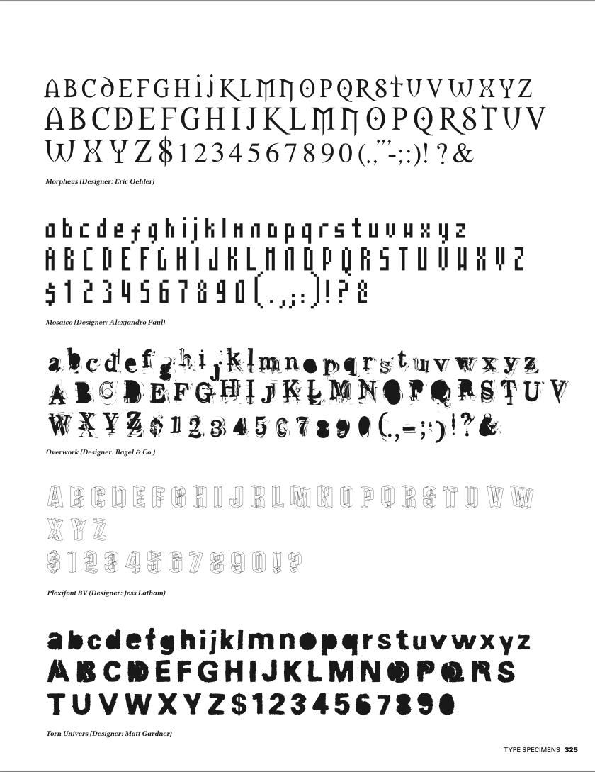
fig 11.1 typeface
I had end reading the book by the several typeface author had shows us for the
last few pages. There is too much of typeface inside the book that impressed
me and too much knowledge that I din't know about typography.
Comments
Post a Comment