Final Compilation & Reflection
Typography / Final Compilation & Reflection
29/5/23 - 7/7/23 / Week 9 - Week 14
Low J- Yin / 0352888.
Bachelor of Design in Creative Media / Typography
INTRODUCTION
INSTRUCTION
1. Task 1: Type Expression & Text Formatting
2. Task 2: Typographic Exploration & Communication
3. Task 3 : Type Design & Communication
Task 1: Exercise
4/4/23 - 2/5/23 / Week 1 - Week 5
Exercise 1: Type Expression
JPEG and PDF files: Type Expression

fig 1.0 Final Type Expression, jpeg,(22/4/23)
fig 1.1 Final Type Expression, pdf, (4/22/23)
GIF files: Animated Type Expression

Exercise 2: Text Formatting
JPEG and PDF files: Text Formatting

fig 1.3 Text Formatting Layout, jpeg,(10/10/23)
fig 1.4 Final Text Formatting, PDF, (10/5/23)
Final Text Formatting Layout
HEAD
Font/s: Bembo Std / Bold
Type Size/s: 55 pt
Leading: 57 pt
Letter Spacing: -15
BODY
Font/s: Serifa Std / 45 Light
Type Size/s: 10 pt
Leading: 12 pt
Paragraph spacing: 12 pt
Characters per line: 61
Alignment: left justified
Margins: 12.7 mm top+ left + right + bottom
Columns: 4
Gutter: 5 mm
JPEG and PDF files: Text Formatting Grid

fig 1.5 Final Text Formatting-Grid, JPEG, (10/5/23)
fig 1.6 Final Text Formatting-Grid, PDF, (10/5/23)
 fig 1.7 Final Editorial Text Spread, JPEG, (21/5/23)
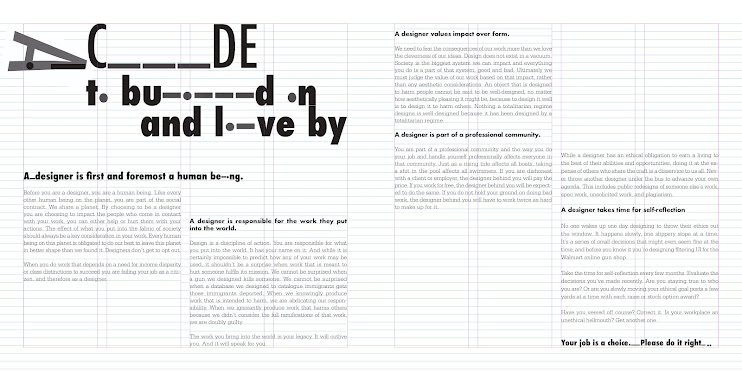
Task 2: Typographic Exploration & Communication
1/5/23 - 19/5/23 / Week 5 - Week 7
Final Text Layout
Margins:12.7mm
Gutter:5mm
Head
"A Code" Font : Futura/ Condensed Medium
"To Build on and Live By" Font : Futura/ Condensed ExtraBold
Sub Heading
Font: Univers LT Std / Extra Black
Paragraph Heading
Font: Futura/ Bold
Body
Font: Serifa Std
Type Size: 9 pt
Leading 11 pt
Characters per-line : 60
Alignment: Left Justified
JPEG and PDF files: Editorial Text Spread
 fig 1.7 Final Editorial Text Spread, JPEG, (21/5/23)
fig 1.8 Final Editorial Text Spread, PDF, (21/5/23)
JPEG and PDF files: Editorial Text Spread Grid

fig 1.9 Final Editorial Text Spread Grid, JPEG, (21/5/23)
fig 2.0 Final Editorial Text Spread Grid, PDF, (21/5/23)
Task 3: Type Design & Communication
15/5/23 - 9/6/23 / Week 7 - Week 13
Screen grab of "New Metrics Window" :

fig 2.1 kerning, JPEG, (26/6/23)
Font Link Download
JPEG and PDF files: Latino font

fig 2.2 Final task 3A: Type Design and Communication "Latino", JPEG, (27/6/23)
fig 2.3 Final task 3A: Type Design and Communication
"Latino" ,PDF, (27/6/23)
JPEG and PDF files: A4 Poster of "Latino"

fig 2.4 Final task 3A: Type Design and Communication "Latino", JPEG,
(27/6/23)
fig 2.5 "Latino" Typo A4 Poster, PDF, (27/6/23)
Reflection
Experience
Its was a very tough but exciting module. From level one to now, I would say is very hard module, but I appreciate to have learned so many in typography. Different typeface really have their own personality and characters, and this making the module very fun and excited.
Observation
What tools and typeface you used could reflect your personality. Even just a type of type font have their own different weight, when it back to FontLab and Illustrator and you make some adjustment, there will be new typeface event just a little change and adjustment. By the different tools, different weight of line, different strokes, its would create thousand type fonts.
Findings
You need typography every single day in life. Maybe the drinks you had, such as: Coca-Cola. The style of the lettering used is called "Spencerian Script", Even the "M" front "McDonald" are a kind of type font which we always used, called " Helvetica Black". If wasn't this module, I won't find out my favourite food and drink brands had their own signature type font.

.png)


Comments
Post a Comment