Task 2 / Exercise
Typography / Task 2: Typographic Exploration & Communication
14/5/23 - 28/5/23 / Week 5 - Week 7
Low J- Yin / 0352888.
Bachelor of Design in Creative Media / Typography
LECTURES
Click here to refer to
Task 1.
INTRODUCTION
<iframe
src="https://drive.google.com/file/d/12pGq93BDBYd4zwm_YLu1GQdtscJ3zDS3/preview"
width="640" height="480" allow="autoplay"></iframe>
TASK 2: TYPOGRAPHIC EXPLORATION & COMMUNICATION
For Task 2, We will need identify the chosen editorial text option and choose
one of four to be our final editorial spread. The option as below:
1.The role of Bauhaus thought on modern culture
2.A code to build on and live by
3. Unite to visualise a better world

fig 1.1 Research of code
I had research on Pinterest and Google search for three of the
options to decide which option are more prefer to me. As the result, I
choose 'A code to build on and live by' as my final and having further
development and research on it. By the research, I noticed that code
usually used "<>""{}"".""()""10101" to represent code.

fig 1.2 Process of text expression
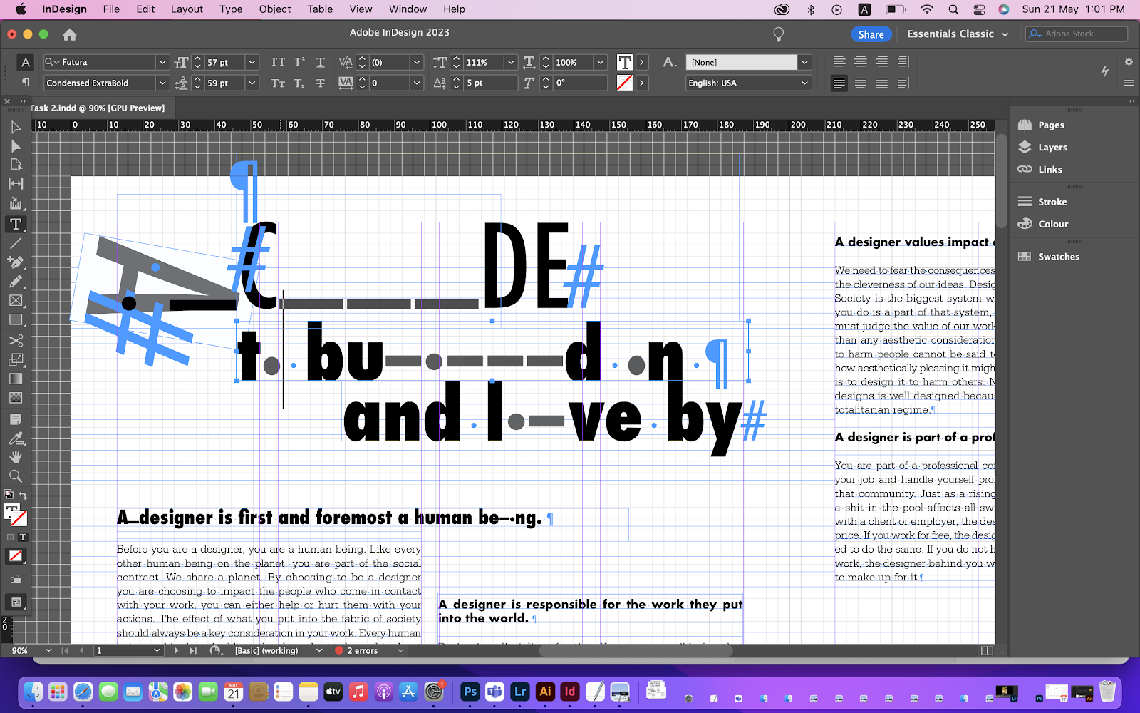
I had opened my InDesign to started demo how place the element I had
research on into the text. For the left, I try to place the 'A' beside the
'C' to make it looks like its a '<', and placing the 'C''O''D''E' like
a stair shape to make the alignment as how coding is. As the end of the
world, placing the /> to make it looks like the coding had end.
For the right, I am trying to place the code like "1010101", but replace
it as 'code'. I din't do anything to other words to hierarchy the 'code'
as the main.

fig 1.2 Process of text expression

fig 1.4 Research of moscode

fig 1.5 typeface of moscode
From the further research of moscode, I find out a typeface of mosocde, and
tried develop on the 'CODE'. To decide a better option, I moved on to next
step.


Last, I checked on the even space and the grey space between the white
space whether it is balanced. The results looks good and the feedback from
sir are positive, so I decided to use this current design as my final
editorial spread.

fig 1.5 Process of text formatting.
Refer to Task 1, I repeated the lecture playlist again, to make sure
the formatting are right and I did not missed any step of the process
of Text Formatting.
1. I had checked on the Units & Increments, by pressing 'File -
Preferences - Units & Increments - Tracking & Kerning - change
the '20 / 1000 em' to '5 / 1000 em'.
2. I had checked on the margins and column, by pressing ' Layout -
Margins & Column ' and adjust which more prefer.
3. I had checked all of the text paragraphs.
- Text fonts
- Text Sizes
- Leading
- Typeface
- Space After
- Hyphenate
-Characters per-line
4. I opened the ' Hidden Character' by pressing ' Type - Open Hidden
Character ' to checked if there any additional line or space that I
accidentally pressed.
5. Next, by pressing 'View - Grid & Guides - Shows Baseline
Grid' , to adjust the baseline of the paragraph.
6. Last, I adjust the different alignment to check on which one are
better.

fig 1.5 Process of text formatting.
By the process, I had placing the text expression and text formatting.

fig 1.6 Process of editorial spread
I had shows the editorial spread above to sir to have better improvement.
Sir had given me advise to use real moscode and could design on ' to build
on and live by' as the heading are quick long. Could try using the ". __ "
placing behind the heading.
fig 1.7 Process of editorial spread
By the feedback, Instead of placing behind of the words, I coloured
the ". __" to grey colour and using the "i" "l" to create the moscode, and
placing "." to represent "o".
fig 1.8 Process of editorial spread
I had changed the baseline shift of "." "-" for the sentence of " to build
on and live by". As for the "CODE" , I had use different type of Typeface
to enhance the wording, the "_" remain the same. For the letter "A" I had
moved the tracking/ kerning for the "-""." to let it placing balanced in
the letter "A".
fig 1.9 grey space
Margins:12.7mm
Gutter:5mm
Head
"A Code" Font : Futura/ Condensed Medium
"To Build on and Live By" Font : Futura/ Condensed ExtraBold
Sub Heading
Font: Univers LT Std / Extra Black
Paragraph Heading
Font: Futura/ Bold
Body
Font: Serifa Std
Type Size: 9 pt
Leading 11 pt
Characters per-line : 60
Alignment: Left Justified

fig 2.0 Final Editorial Text Spread, (21/5/23)
fig 2.0 Final Editorial Text Spread PDF, (21/5/23)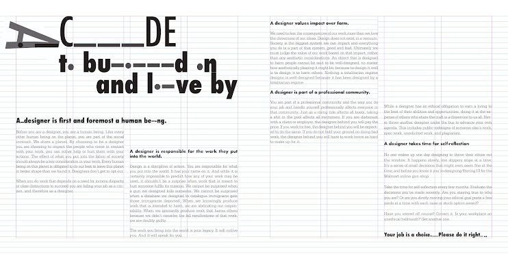

fig 2.1 Final Editorial Text Spread Grid, (21/5/23)
fig 2.2 Final Editorial Text Spread Grid PDF, (21/5/23)
FEEDBACK
Week 6
Specific Feedback - Be careful with the raging. The code uses the ._ on
behind the words or using ._ to represent the Morse code. Using the real
Morse code to do, don't simply place the dots and underscore.
Week 7
Specific Feedback - Sir was checking around for our task 2 final. Everything
is fine, looks good.
REFLECTION
Experience
For task 2, we will need to combine both of the exercise from task 1 into one
paragraph. I started enjoyed when doing this assignment. Sir would give us
feedback every week. For this task, we only got 2 weeks but after the
experience from task 1, we can do it more easier on this.
Observation
Different typeface have their own character and personality. What tools and
typeface you used could reflect your personality, this is what sir tell us on
class and I agreed what he said. Even just a type of type font have their own
different weight. Some are fat font, round font, bold font, etc.
Findings
I know I had said typography makes me fell struggling on task 1, but I need to
admit we need typography in our life every single day. Who knows, your
favourite food, favourite drinks or even your future company are using
typography to build up their logo. In fact, from all of this reason, I likes
typography.
FUTHER READING

fig 2.3 A type primer
For week 6 - week 8, I decided to read this book: A Type Primer by John Kane.
Its was recommend by sir and the book attracted me for the strong contrast
colour.
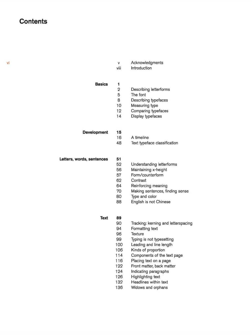
fig 2.4 content of the book

fig 2.5 basic
The first few pages had been teach by sir in lecture playlist, so I din't note
down anything and review the basic elements from the books and my lectures
note.

fig 2.6 introduction
I had continued read and reviews the knowledge that I know from lecture
playlist. As the fig 2.6, A type of typeface have many different weight. The
author shares a lot of different of samples behind the current pages too.

fig 2.7 Timeline

fig 2.8 type expression
As like what author had said at the first few pages, the most simple is the
most straight-forward way to express the type. As fig 2.8, the author using
very clean and simple way to express the meaning of the words. Personally, the
author shows few of the sample but I love fig 2.8 the most, especially the
type expression of "added". Its very simple, he just placing the "d" as like
"adding" into the sentence, he din't even move a lot of stuff or use a lot of
tools, but the type expression are strong and give us a very straight and
focus way, its catch our eyes very easily.

fig 2.9 Poster Bodoni
The author shows us a lot of different design of poster using typography,
which is very cute and nice.


fig 3.0 the grid of text
I had end reading the book by review the grid of text. The lecture playlist
had actually included all of the important parts for basic knowledge, so I
just review my notebook while reading the book.

.png)

Comments
Post a Comment